I'm Michael Suodenjoki - a software engineer living in Kgs. Lyngby, north of Copenhagen, Denmark. This is my personal site containing my blog, photos, articles and main interests.
News Archive 2004
Updated 2011.05.07 21:28 +0200 |
Weekly Photo #52
December 24, 2004 | 0 Comments
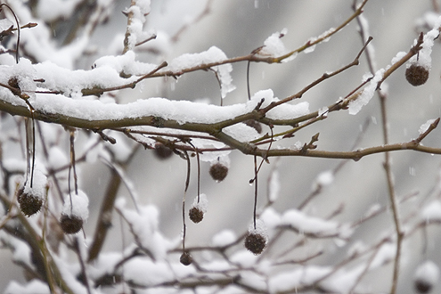
What can be better on the day of Christmas eve than the snow slowly falling outside the window? That's the way it is supposed to be. Can you all have a merry Christmas and happy holidays.
Weekly Photo #51
December 15, 2004 | 0 Comments
Visited Countries - 7%
December 15, 2004 | 0 Comments
The number of countries that I've visited accounts for 7% of the world accordingly to www.world66.com. Not much. Obviously I have still a lot to see - and learn.
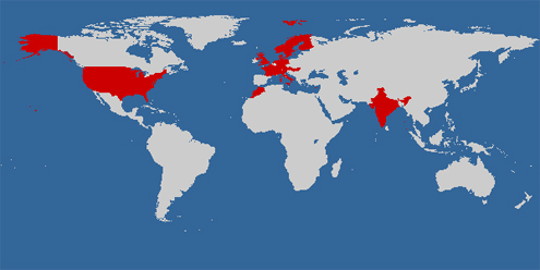
Create your own visited country map.
Weekly Photo #50
December 8, 2004 | 0 Comments
Better Television on Internet?
November 29, 2004 | 0 Comments
So you're sitting in front of your TV and are zapping through the channels, just to discover how much shit they're broadcasting. Too many American bad TV shows (oh yes, you know it).
Interestingly the amount of time spent on the Internet is increasing dramatically in contrast to television and radio for that matter; find yourself an appropriate statistics supporting the statement. I have an idea of why. You can see what you want, when you want it (and some of it for free, though that may change).
I've already earlier pointing you into a great radio show - namely BBC's In Our time.
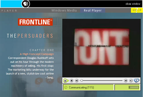
Now I've found an interesting TV program from PBS Frontline about the advertising industry. It describes how advertising has found and dealt with their own produced clutter.
Some keywords from the program: advertising skin, branding, focus groups, DVD recording, deleting commercials with TiVo, advertising in movies?, customized advertising (narrow casting), The Persuaders, control?
Weekly Photo #49
November 28, 2004 | 0 Comments
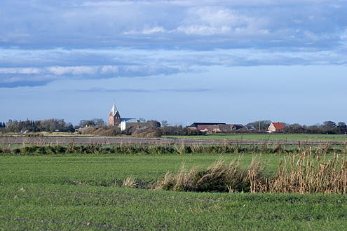
Not much to say. Just a beautiful landscape from south western Denmark.
Weekly Photo #48
November 21, 2004 | 0 Comments

This weeks photos is shot with my little digital camera which I usual carry around with me at all times. The photograph is actually a crop of an advertising poster for Toblerone chocolate. I find it rather funny and acknowledge the idea behind it. I have my doubts about whether the chocolate piece in the cheek really is photographed. I think it is Photoshopped. The poster is by the way part of a larger advertising campaign started by Kraft Foods in 2001, the mother company behind Toblerone. I've tried - without luck - to find out who had taken the photo and/or which (advertising) company that had "made" the picture.
I took the photo back in February this year. That is a record for showing such an "old" photo on my weekly photo column. Reason? Well, it is not often that I empty my extra mega small 16MB Compactflash memorycard.
Dragon Illusion
November 21, 2004 | 0 Comments
I like practical puzzles and illusions. Below you should be able to see the movie demonstration the dragon illusion. If not. or if you want your own dragon, or would like to know how it works you should jump to http://www.grand-illusions.com/dragon.htm. Have fun.
Weekly Photo #47
November 14, 2004 | 0 Comments
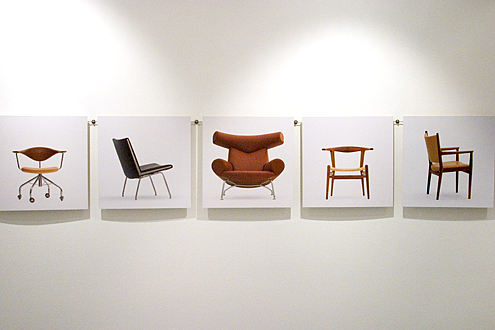
Denmark is known abroad among other things for its many architect drawn furnitures. They are popular and are easily sold on auctions. One of the best known furniture architects is Hans J. Wegner born in the city of Tønder, Southern Jutland in 1914. In connection with Tønder Museum and the connecting Art Museum stands the old city water tower that now contain a permanent exhibition of all of Wegner's famous chairs. The exhibition is worth while a visit and while walking up the tower you see all the chairs, you can even try them out, see the designs and end at the top with a wonderful view over the city of Tønder and the marshland. Also I would recommend visiting the connecting Art Museum (Sønderjyllands Kunstmuseum) that also have something to offer. Its changing exhibitions are more modern and especially the museums blue rotunde (round building or room) with echo sounds are something to experience.
City of God
November 10, 2004 | 0 Comments

I've seen a movie that I have wanted to see for some time - namely the movie City of God (Cidade de Deus in Portoguese). The reason has primarily been due to its high ranking at imdb.com. What I didn't know was that photography plays a little role in the movie. The main character becomes a photographer on a newspaper and documents with his camera the raw gang violence in Rio de Janeiro that is the storyline of the entire movie. A nice little extra dimension for us photography freaks. The movie is particular good with its intertwined storylines. Everything should be based on real events. Fascinating movie for an exciting evening.
Weekly Photo #46
November 7, 2004 | 0 Comments
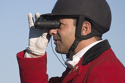
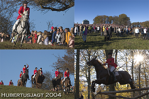
Once more it was time for the Hurbertus Hunt, a traditional old-school hunt from the back of the horses. It takes place every year, the first Sunday in November, in Dyrehaven, approximately 16km (10 miles) north of Copenhagen, Denmark in Forest District of Jægersborg. The weather was as usual fantastic with the autumn sun placed low on the clear sky. And that was something that could be seen on the number of spectators which was close to 40000 people (no kidding).
This year I've chosen to focus my camera on the jump, that is, the horses, their riders and the jump. After the hunt I took a walk in the forest and got the opportunity to capture some of the deer's. All in all a very good (photo) day.
The Incredibles - great movie
November 7, 2004 | 0 Comments
I've seen the The Incredibles - the new computer animated cartoon movie from Pixar (you known them with Toy Story and Find Nemo). And I must immediately say that it is an incredible entertaining movie. Can warmly recommend it to kids as well as adults. So take the time to invite the grandchild, nephew or niece to the cinema. The Incredibles is simply a great movie. Have pleasure.

Weekly Photo #45
October 31, 2004 | 0 Comments
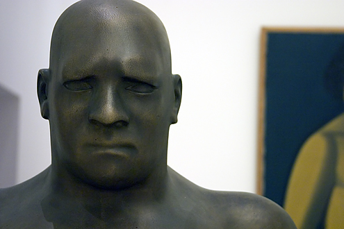
This weeks photo is a photograph of the bronze sculpture The Man (1920) by the Danish artist Svend Rathsack (1885.09.08-1941.12.14). The photo is taken in room 266 of museum Statens Museum for Kunst (The Danish National Gallery). If you visit Copenhagen (Denmark) I recommend you to visit the museum at the moment due to the special exhibition Turner and Romantic Nature. Sadly it is not allowed to take photographs at the special exhibition, probably because the museum has to earn a living selling postcards and other related stuff. But you may take photos in the standard exhibitions.
Great radio In Our Time
October 30, 2004 | 0 Comments
While eating my Saturday morning breakfast I was listening to the radio in where there was mentioned (thanks to Jens Olaf Jersild) a particular series of BBC radio programs as being particular educational and worth listing to. The series of programs are named In Our Time and is currently hosted by Melvyn Bragg. I quickly found the website for it and looked into their archive where you can hear all the previous shows. It is simply an astonishing list of topics ranging from scientific over historic to philosophy topics and discussions. I've already listened to the following shows:
- Rhetoric - from the original sophists to latter-day demagogues
- Pi - the number that doesn't add up
- Cryptography - secret history of ciphers and codes
Weekly Photo #44
October 24, 2004 | 0 Comments

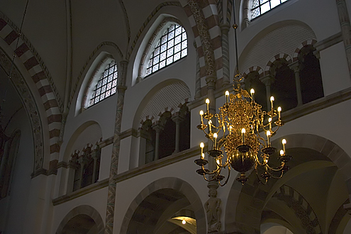
While Halloween is not celebrated that much here in Denmark I do see a tendency for this to increase - at least the celebration has increased the past years, mostly due to the general America influence and by the shops selling the accessories.
Nevertheless I wish you a happy Halloween.
Fake or photo?
October 24, 2004 | 0 Comments
I was looking at some optical illustrations from a newspaper article about one of Al Seckel's books - named More Optical Illusions. From there I spent a couple of hours surfing the net and found some interesting sites that I would like to share:
- Is it real or is it photoshopped? Article from Discover magazine.
- Fake or photo - take the quiz. I got 8 right out of 10 (not bad).
- Technical papers from Hany Farid (University of Dartmouth)
- Photoshop Competitions at www.worth1000.com
- Examples of optical illusions at www.eyetricks.com/illusions.htm
Update August 24, 2005:
- See also Photo Fakery article from OE Magazine.
Jazz
October 21, 2004 | 0 Comments
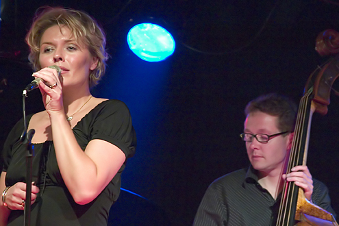

I don't go often to concerts, however when I noticed in the local newspaper that there was a jazz evening arranged at the local music place Templet with Jesper Bodilsens Trio and Katrine Madsen I couldn't resists to join it. The evening was arranged by the local Jazz club (Lyngby-Taabæk Jazzklub) and I must congratulate then for the splendid evening and the excellent concert.
I did of course bring my camera and had planned that I wouldn't run around as a press photographer. It can have its advantages, but I do like Jazz and would like to enjoy it, so I had decided to find a fixed place from where I could take my photographs without disturbing the musicians. That meant that I had to use a small aperture value (large aperture) to get as much light in as possible. Luckily my 10D have an ISO option of 3200 which helps considerably. Normally such a high ISO setting gives a lot of noise, but I think it fits well into the jazz atmosphere.
Weekly Photo #43
October 17, 2004 | 0 Comments
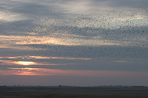
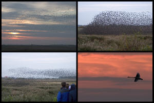
Returned home safely from a really good autumn holiday and with more than 700 pictures in the memory cards I've spend most of the last two days to sort out the photographs. From the start it was clear that the great nature experience of the holiday must be documented via this weeks photo. I'm of course talking about the nature phenomenon Black Sun where thousands of starlings meet in large flocks to find a place for the night in the mires of the lakes.
It was quite an experience to take the car to the border area between Denmark and Germany - the so called Tønder marsh. We had phoned a nature guide to ask where the chance of seeing the phenomenon was the highest, and after following a couple of tourist busses to the area around the German city of Aventoft we could see people standing on the dike. We parked and walked up to the dike, joking that the starlings birds would arrive at 6pm and oddly the first flocks arrived when the church bell in Aventoft started to chime. As first timers we were incredible lucky with the location. The flocks of starlings went down in the mires of the lakes just about 110 yards (approx. 100 meters) away from our location. The shutter was glowing on my camera. I've created a postcard below in which you can click into some pictures that offer a feeling of the experience.
Weekly Photo #42
October 8, 2004 | 0 Comments
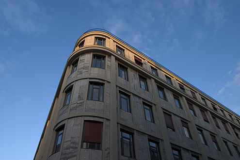
From my last mega photo day in Copenhagen I took this weeks exciting photograph of the corner building Nikolajgade/Laksegade (towards Holmen Kanal) in Copenhagen. I've unsuccessfully tried to find more information about the house. If anybody out there knows something about the history of the building, the architect or similar I would like to know.
It is holiday time here in Denmark and my family have arranged a trip the the south-west coast of Denmark to the so called Wadden Sea and I hope that I will be able to take a lot of nice photographs with my new lens. Happy holidays.
Weekly Photo #41
October 3, 2004 | 0 Comments
I've bought a new 70-300mm telephoto lens for my digital camera. It somewhat completes my lens equipment to cover the range from 17mm wide zoom to astounding 300mm telephoto zoom. The lens is the semi-professional Canon 70-300mm f/4.5-5.6 DO IS USM and is my first real telephoto lens. After reading a couple of reviews of it - especially the nice review at The Luminous Landscape - I decided to give it a shot even though it's a rather expensive lens. What counts for me is the size and weight of it since I'm often walking several hours during my photo trips and travels. Also I like that its black which is more anonymous than the normal white Canon telephoto lenses such as the 70-200mm's.
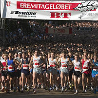
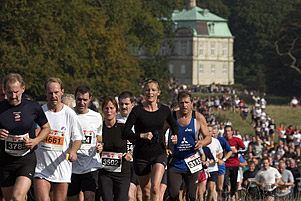
To test it I joined about 19000 runners to the traditional Eremitagerun with a distance of 13.3 km (about 8.3 miles). The course was set at the forest Jægersbog Dyrehave about 10 km north of Copenhagen running in beautiful surroundings. The weather was excellent with the sun shinning on the lovely autumn forest.
Weekly Photo #40
September 26, 2004 | 0 Comments
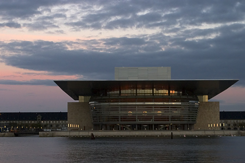
Amazing day - yet another mega photography day with more than 300 shots distributed over 7 hours in Copenhagen Zoo and other places in Copenhagen. With today's shoot I've reached my 10000 photograph with my EOS 10D digital camera and the internal camera file counter is now restarted with 0000.
The day started with a walk at Vesterbrogade towards Copenhagen Zoo in Frederiksberg, Copenhagen and while I didn't take any photos I pinpointed some interested places that I would like to photograph - especially two old coin washing shops, knowing that they have a special atmosphere that may work well in a photo. At Zoo I had planned to see an event from the BBC Natural History Unit as part of the weeks Danish Science Festival. They talked about different photography gear used for wildlife shoots and the future of interactive multimedia storytelling. I was most impressed by them showing of some time lapse videos.
After the presentation I naturally took a walk in the Zoo and practiced my photography skills - you never can shoot enough and a Zoo passport (yearly ticket) should be on every photographers most useful "gear" list.
After the Zoo and lots of animal photos I walked back towards Copenhagen center and stopped at the points that I've noticed earlier. At a point I walked into one of the sex video shops because I wanted a shoot of the "colorful" DVD cases of the sex videos. However the shopkeeper wouldn't let me take a photo because, as she said "our customers don't like it...". Naturally I accepted that reason. The point is that you should always ask for permission. In that way you don't offend anybody but you do also get a chance to get social - maybe you even get some useful information.
Nevertheless the time went fast and the sunset was getting closer. In Copenhagen the new Opera House will be delivered to the state at October 1st and it will open up for the public. Naturally - as everybody else - I would also like to take a photo of the Opera House and why not photograph it in a colorful sunset. And that is the shot chosen for this weeks photo. Enjoy.
Weekly Photo #39
September 19, 2004 | 0 Comments
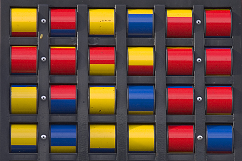
September is filled with birthdays in my family. Yesterday I went to my fathers birthday and we walked to a couple of children playgrounds after dinner so that my nephew could play around. It was a good photographing opportunity because the family was occupied with playing and was not focused on my shooting. The above photo for this weeks photo is actually a crop of a particular colorful part of the playground. I don't know why but Scandinavian playgrounds always seem to be designed with a lot of colors - see example.
Architecture wishlist
September 19, 2004 | 0 Comments
 Recently I've been more interested in capturing some good
architecture photos and I've added a couple of places to my visiting list, e.g. the
Turning Torso residential building in Malmø (Sweden) and the new Dutch
inspired living quarters Fyrholm at Sluseholmen in
Copenhagen, designed by more than 30 different architects.
Weekly Photo #38
September 12, 2004 | 0 Comments

I seems to dwell in the colors of the sky. They are indeed beautiful so my other photographs are having a hard time competing with the vivid colors of the sun in the sky. When I reviewed the photos for this weeks photo most of them were actually from the last week trip to Vesterhavet, however the selection was set to a picture from my apartment window. Enjoy it.
Weekly Photo #37
September 7, 2004 | 0 Comments
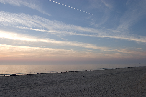
In the weekend I was on a lovely family weekend at Vesterhavet. The weather was uncharacteristically excellent and the Danish west coast showed itself from its gentle side. Of course I've brought my camera and had decided to photograph the sunset as well as the sunrise. The picture above of the sky is during the sunset.
The way of browsers...
September 3, 2004 | 0 Comments
... are going in mysterious directions. Recently I've tried to fix a problem with the layout of this page in the Firefox browser. I shouldn't have done that because I discovered how differently the different browsers behaves. Sigh.
Try this CSS float and clear testing page.
I don't like underscores...
August 31, 2004 | 0 Comments
... and I never will. That's the conclusion from reading a post by Mike Davidson and which got me thinking that I would like to support that.
In my daily work as a C++ programmer I see programmers that uses the underscore character in variable names. And I hate that. I did wrote a programming (layout) standard for the department, but it has never been accepted by my fellow programmers, so we don't really have a programming standard. Oh, I forgot. We do have one, but it's crappy and not nearly as thorough as the one I wrote - at least it doesn't say anything about variables names. But there are only three reasons for saying something about variable names - namely Readability, Context Sensitivity and Maintainability. I won't go into the details about this, but the underscore character do not score on these points.
So support the fight against using the underscore character ... by writing a "I don't like underscores...".
Weekly Photo #36
August 29, 2004 | 0 Comments
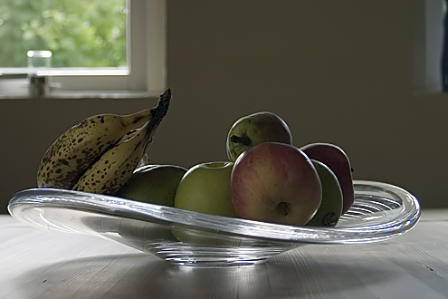
I've changed a bit of the layout on the site. As a regularly visitor it shouldn't disturb you because the changes are minimal. At the moment I've also testing a color change of the logo and hyperlinks. Now the colors are taken from the weekly photo and this should give a calmer sense for first time visitors.
Icon Design
August 26, 2004 | 0 Comments
After I wrote my article about how to create a Windows XP folder icon back in February 2003 I still occasionally follow threads on the Internet on the subject. Dan Cederholm at SimbleBits.com has recently described in his blog entry The Anatomy of an Icon how he design icons.
Weekly Photo #35
August 22, 2004 | 0 Comments
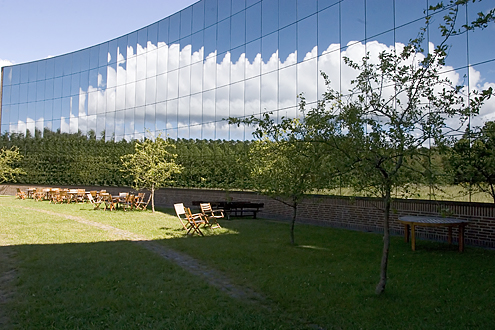
Weekly Photo #34
August 21, 2004 | 0 Comments
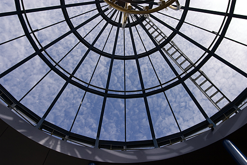
WeeklyPhoto.com?
August 9, 2004 | 0 Comments
Some times you just don't know what to do and you browse the Internet. This can lead you to funny places. For instance, my weekly photo lead me to investigate whether www.weeklyphoto.com was taken as domain, and sure thing, it was. It show of nice Asian girls (may be Chinese girls?) It seems to be a photographer that takes photos of clothes - may be for a magazine. Who knows?
Weekly Photo #33
August 8, 2004 | 0 Comments
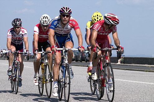
As you may have guessed I usually post my weekly photos on Sundays. I have no rule about this, it just happens to be a very natural time for me to do so. The main reason is that I usually shoot most of my photos during the weekend. Unfortunately I don't have the time to take photos all week long - I do have a 9-5 job where photography does not play a role. However I do what I can to do go out photographing.
For this Sunday I planned to shoot some photos of the professional cyclists racing in the Tour de Denmark - called Post Danmark Rundt in Danish. I planned to take a panning shot and wanted to have a nice background. Unfortunately panning shots are far from easy and you have to very lucky to take a good one - such as my weekly photo #27. So I didn't really got a decent panning shot this time. You only have 10 seconds or so because the cyclist are gone after that.
Weekly Photo #32
August 1, 2004 | 0 Comments
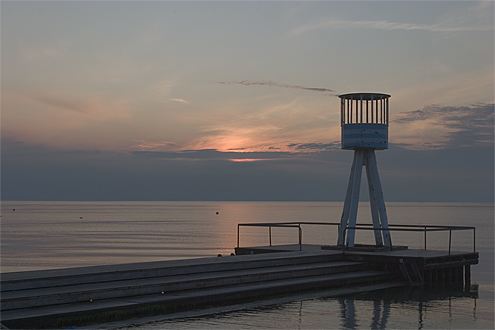
Mission: Sunrise at Øresund. An examination of the time of sunrise revealed that the expected time was about 5 am. The alarm clock was set to 4 am together with a hope that the body would accept the challenge. It barely did and I went up a bit late. After a quick bath and packing of the photo gear I took of on my bike towards Øresund at 5 am. It was lovely weather even though the fog looked omnious thick. At arrival at Bellevue beach I could see that the sun already had risen, but luckily the sky still proved some great light here at Øresund - the east coast of Denmark. I quickly setup the equipment and decided to find some different angels of the local Bellevue beach tower. After 10-20 photos I noticed that the sky quickly changed to the worse. Due to the warm sun the air quickly built up gray sky covering the sun. Not good. I sensed the problem and calculated that the sun would take some hours to burn off the sky. It was time to return to base. So I turned the bike and went tired home.
Photographic paintings?
July 27, 2004 | 1 Comment
Once in a while Swedish national TV can show something which the Danish national channels can not. Yesterday Swedish channel 2 (SVT-2) aired two programs which was very interesting.
The first was about science and the hunt for the theory about everything - among one of these the string theory. I wont discuss the program but would like to mention that the Swedish channel has a series of science programs - aired under the named Videnskabens Verden (the world of science) - which are much better than any of the science programs aired on Danish national television. Maybe the reason is that the buy foreign quality documentaries.
The other program was the documentary titled "David Hockey's Secret Knowledge - Rediscovering the Lost Techniques of the Old Masters" which is also available as a book. In the program the British artist David Hockney reveals his "discovery" of how many of the renaissance painters were able to paint so precisely that the paintings looks like photographs. Because at that time the camera wasn't really invented. So what did they do? Did they really paint so good by eye?
If you examine a painting from that time, e.g. the Italian painter Caravaggio's (1573-1610) oil painting "The Cardsharps" (c. 1595) (see below) the persons are incredibly detailed - some may argue that it approximately looks like a photography (perspective, colors, light, shadows, texture, etc).
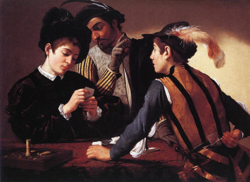
Hockeys claims that some of these paintings contains apparent errors. For example he names blurred (unsharp) areas (areas which are not in focus) or perspective distortions. In the painting above Hockney claims that the two boy card players in the foreground are paintings of the same boy, just painted in different clothes and positions, and that the man in the back shouldn't really look down at the back of the left boy. Rather he should had looked at the cards in his hands. This should indicate that the man in the back also was painted as a stand alone painting and simply merged into the painting, without really checking that the sight of the eyes are correct.
How did this happen? Is it really bad painting or is it a consequence of the method used? Hockney tries by examples to show us that some painters at the time first used mirrors and later, when the lens was invented in the first half of the 1500 century, that lenses was used to transfer the light (of the subjects) to a canvas, so that the painter could "paint" the image reflected.
This method is also known by the name camera obscura. It's Latin and means dark room and is renowned to be the first camera in the world. Hockney shows how you can build your own camera obscura - and even demonstrate how you can use this for drawing a reflection.
The program is entertaining because Hockey's examples are funny and thought-provoking. You doubtfully questions whether painters at the time really was so "good" to paint as well as commonly understood. Or this is what you conceives to think. It is probably a lot harder than it seems. At the time the painters must have been in fierce full competition. Everyone wanted to be the best. Who would reveal his methods to paint most realistic. That can be one reason for why we haven't believed, or found proof of, that so many more paintings than originally understood was painted with this method. That they really was painted photographs.
I believe that one can say that Hockney's claims are loosely founded and aren't really presented with a scientific proof. Obviously there has been counter reactions from the art world that tries to reject his claims. Look for yourself on the Internet and you may e.g. find the following enjoyable article "Why David Hockney Should Not Be Taken Seriously" by Brian K. Yoder.
Under all circumstances the program was fun to watch and I really enjoyed watching it. Very interesting.
More links:
- Clips from David Hockney's program.
- Vermeer's Camera Obscura, Vermeer's Camera
- History of Photography
NOTE: The program is repeated on Sunday, August 1'st at 2.20pm (kl. 14.20) on Swedish Channel 2 (SVT-2).
Comments
2004-07-29 Preben T. A. Arentoft
Thanks for pleasant texts and pictures. Nice weblog.
I've just read your latest entry and I think that I've watched parts of the science program that you mention online. I'm
pretty sure that it was some at http://www.pbs.org/wgbh/nova/elegant.
Thought you would like the link.
Regards
Preben
Write your comment - via e-mail.
Weekly Photo #31
July 25, 2004 | 0 Comments
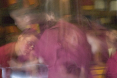
I have to use some of my many photos from the trip to India, so here's one more. I chose it among 3 other fine photos that I had selected and which haven't yet been presented in my India photo gallery. The photo is taken at the monastery in Tikse where we in the early morning experienced the morning prayer from the monks. A found it to be a very special experience. The monks sat at their benches and recited the prayers while there were served their morning breakfast. It didn't look particular tasty. The photo above is taken when one of the young monks serves the breakfast.
Actually I recorded about 12 minutes of the prayer and for you I have extracted 2 minutes of the delightful prayer:
We weren't allowed to use flash so the cameras' high ISO setting was extremely useful. With my weak light sensitive lenses it was still very difficult to get a good photo. As you can see above the photo contains both ISO noise and movement blur. Anyway I feel that the photo someway contains the mood for the experience.
Wake up...
July 19, 2004 | 0 Comments
Well, that was the first workday after a 3 weeks vacation. I'm writing this entry before I've forgotten it and will be entangled in the laziness of everyday grind.When you have been away on holiday - especially abroad, it is pleasing to come back to Denmark. The unmistakable scent of the Danes inflamed grills is hanging lovely in the air and the girls looks infinite beautiful in their light dresses. By some mysterious force you notice these things after a trip away from your country. Also yourself seem to have changed. You have the energy to look people in their eyes, you're clear minded and ready to take the world. Really, you do look at things differently. The news in the newspapers and in the television are indefinitely insignificant and superfluous. Some people, those perhaps which also has been on holiday, smiles at you and nods friendly to you, while other people, those perhaps which haven't yet been on holiday, sits and looks down in the ground, occupied by themselves. They read the stupid free newspapers which anyway contains insignificant crap, that nobody cares about. They don't move anything. Not themselves, not their minds. Lets move. Be active. Do something. We must carry on forward.
That's the thoughts I have after this first day of work. I'm afraid that it wont be long before I myself are soaked into the same everyday pickle, with indifference and internal power struggles.
You want to scream "wake up"!
Weekly Photo #30
July 18, 2004 | 0 Comments
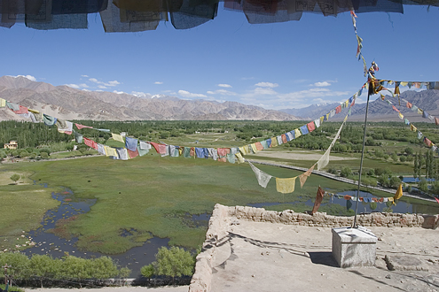
This weeks photo is of course also a picture from my recent trip to India. Let me tell you a little about the trip. It was a group holiday arranged by Albatros Travel -a Danish company, which also have experience with English speaking travelers.
There are both advantages and disadvantages by traveling in a group when you are a photographer. First of all, by traveling in a group you're somewhat protected from your surroundings and you don't have to think about all the practical details about transport etc. However all these things also limits your time for detailed photography. You have to comply to the group mentality. You cannot just stop on the roadside because you've seen an interesting spot for photography. As a group you also take up a lot more space and your instantly recognized as a tourist. You do not easily melt into the local crowd. On the other side, the group can gain access to some places where you as an individual never would be allowed. The travel agency can arrange very special meetings. For example we visited the very famous Kohinoor jewelers in Agra, among other things famous for the spectacular three dimensional embroideries by Shams.
I only had one day why I could decide my own timing and walk around alone. I used it for taking a early morning trek up to the Leh Palace and to King Tashi Namgyals old fortress. That was a nice decent walk in solitude that was very refreshing - also for photographing.
One of the things that I didn't succeeded in was to get some good portrait photographs. I don't have much experience with portraits (yet) and my equipment do not allow me to stand far away to take a photo without the person knowing it. And I'm not too social to ask for permission - must people don't like to have a camera in their face - myself included. I guess this is a skill I have to practice some more on.
India photo gallery
July 16, 2004 | 0 Comments
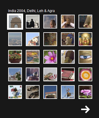
Tough work. That is, selecting the photos from my successful travel to India. At the same time I had to create CD's with copies of the photos to some of the participants on the trip.I've selected 31 pictures and have decided to present on trial basis them in a new way - namely by using SimpleViewer - a free flash presentation method from Airtight Interactive.
Weekly Photo #29
July 13, 2004 | 0 Comments
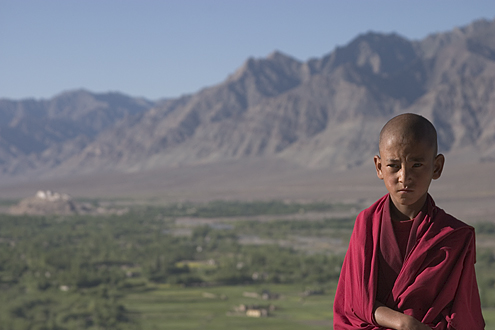
I've just returned home from a fantastic good summer holiday in India - more precisely the cities Delhi, Leh and Agra in northern part of India. At the moment I'm sorting and post processing more than 500 photos that I've taken during the stay. I hope that I soon will be able to present a gallery of some of the best photos.
The future of photo display?
July 3, 2004 | 0 Comments
It's always interesting to see some of the different ways that photos can be organized and displayed. Microsoft is currently working on a project called Photo Triage (probably a working title) that recently was displayed at a Photo Triage news story at cnews.com. More on displaying photos.Weekly Photo #28
July 3, 2004 | 0 Comments
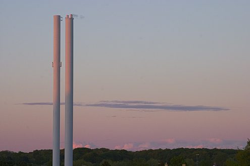
It's not a secret for photographers that the best light - the so called soft light - best can be seen at sunrise and sunset. Here I've captured the light from the sunset in a pair of chimneys and in the sky as seen from my apartment. In this picture I've used the chimneys, however on daily basis they are not exactly nice to look at. They should have some dynamite, should they...
Weekly Photo #27
June 28, 2004 | 0 Comments
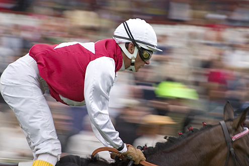
This weeks photo is one out of many photographs (exact 306 to be precise) taken at Klampenborg's racecourse on the occasion of Danish Derby 2004. I was so lucky to be able to take photos wherever I wanted and could therefore play with the professional press photographers. They had the advantage of their big zoom lenses so I had to be a bit creative with my pictures - something which suits me fine. I've collected a few of the shots into a gallery (captions in Danish Only).
Weekly Photo #26
June 28, 2004 | 0 Comments
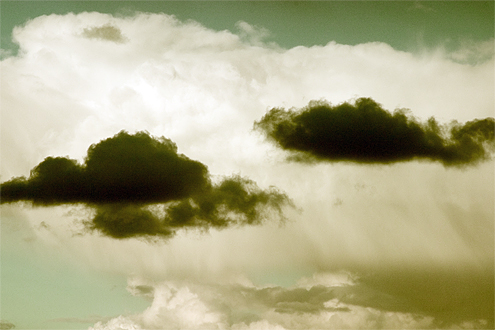
Skies on the heaven can be fantastic photogenic. This week photo is taken from my apartment window after I've notices a good contrasty skyformation with a couple of dark skies on a larger white sky background. To make the picture more dramatic I've color casted it in Photoshop. I think the effect is quite good.
Weekly Photo #25
June 28, 2004 | 0 Comments
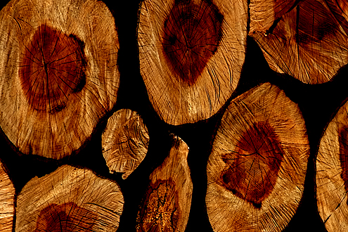
A good walk around Lyngby Lakes took me onto some paths that I haven't been walking before. Always good. I took of course lots of photos. I came by a stack of wood which I thought would make a nice texture. After cropping it and tuning the colors in Photoshop this weeks photo was the result.
Weekly Photo #24
June 13, 2004 | 0 Comments

The European Championship in soccer has started and I would like to mark this with this weeks photo. Beer and football are often consumed together, something which is good for some and bad for others. But hey, that's life. Cheers and may the best team win...
Weekly Photo #23
June 6, 2004 | 0 Comments
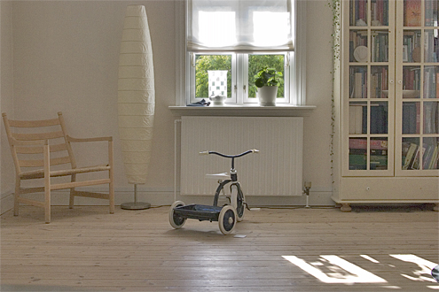
What do we have here? When I reviewed the pictures for this weeks photo there was something about this photo that made be stop. When I took the picture the purpose was to show the living room with the light from the window on the wood floor together with a strict crop without unnecessary disturbing elements in the picture. I'm happy for the child bicycle because it makes you wonder where the child is. The light is also lovely summery - something which I love. I really like the picture. It is far away from just snapping away indefinitely and then be "lucky" with a few good pictures to being very consciously about the subject as this photo. In a way the picture is very Danish and could very well be presented in a living magazine.
100 MB!
June 3, 2004 | 0 Comments
Sorry for the delay with the weekly photo. I've hit the 100MB limit on my web hotel. More than 900 files (inclusive pictures) are distributed over nearly 100MB. The extra time have been used for ordering some more space.Weekly Photo #22
May 31, 2004 | 0 Comments
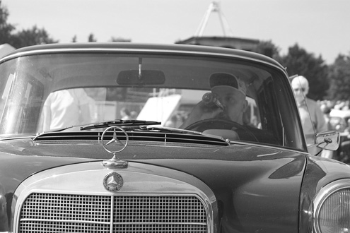
It has been a good photo weekend. The family together had arranged a trip to Græsted Vintage Mechanics Fair where I of course had my camera with me. I must say that I am thoroughly surprised with the result because when I came back home and looked at the resulting photos on the computer they didn't really was as good as I expected. Luckily I got the idea to convert them to black and white and wow that did it. The pictures suddenly came to life and put together into a series they simply went rocketing.
I've created a presentation in SMIL (HTML+TIME) that unhappily only works in Internet Explorer. For best presentation the show will start up in a separate browser window which you always can exit by activating Alt+F4 on your keyboard. Start the show now.
Summer holiday
May 27, 2004 | 0 Comments
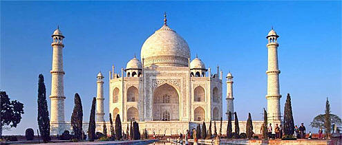
The summer holiday is booked! I've chosen to travel eastwards to the northern part of India. It's a 10 days roundtrip with visits in the capital of Delhi, mountains in Leh and Taj Mahal in Agra. I'm of course expecting to take lots of photographs. I'm already looking forward to it.
Shots of Kill Bill
May 20, 2004 | 0 Comments

As everybody else I've been watching Quentin Tarantino's Kill Bill movies and have found myself highly entertained. As a photographer I noticed that I during the movies found myself aware of some particularly good camera shots. After the movie I could remember them distinctively and I think the reason for why they were great was due to Tarantino's angle of (camera) view. Review them below and tell me whether you agree.
I've selected 3 shots from the beginning of the first movie.
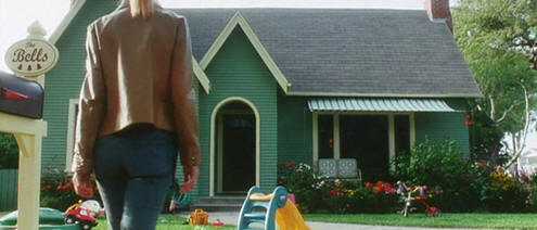
I like the camera position fixed onto the idyllic house while the actor is moving into the frame from behind.
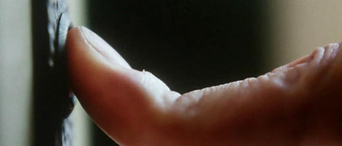
This great macro shot really is zooming in on the action - you don't just hear the ringing bell but Tarantino actually shows you the action in full frame. Simply brilliant.
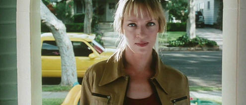
What a frame. I feel the whole movie is cramped into this picture. Revenge is coming..
The next shot is actually about 23 minutes into the movie, where the deadly California Mountain Snake Elle Driver (Daryl Hannah) is instructed not to kill the Bride because Bill says "... that we simply don't do".
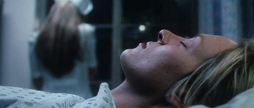
I like the focus on Uma and the blurred background of the mobile phone talking assassin. They are not looking at each other. The situation between them are dissociated and cool and the blue color cast emphasize that.
By the way notice that these frames are actually in aspect ratio 2.33:1 very close to 2.35:1 also known as widescreen. This is a different format that the normal SLR camera format 1.50:1 (or 3:2). As a cinema photographer this must be quite a challenge to think in this very wide format.
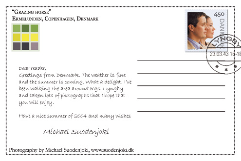
Have a nice summer postcard
May 16, 2004 | 0 Comments
I've been playing with Photoshop and created this postcard. Have a nice summer of 2004. Enjoy it...
Weekly Photo #21
May 16, 2004 | 0 Comments
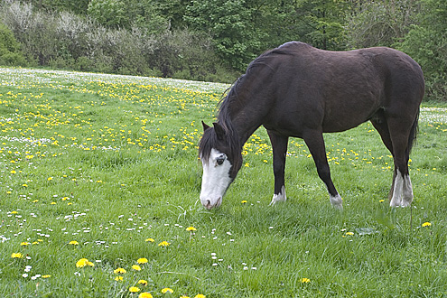
The summer is indeed coming even though the weather here in Denmark seems not to be able to decide. I feel that I need to rise the mood and has therefore chosen this subject for this weeks photo. At Ermelunden, approximately 10 km north of Copenhagen, Denmark it is possible to get close to a few horses that grazes in the dandelion yellowgreen carpet.
Weekly Photo #20
May 16, 2004 | 0 Comments
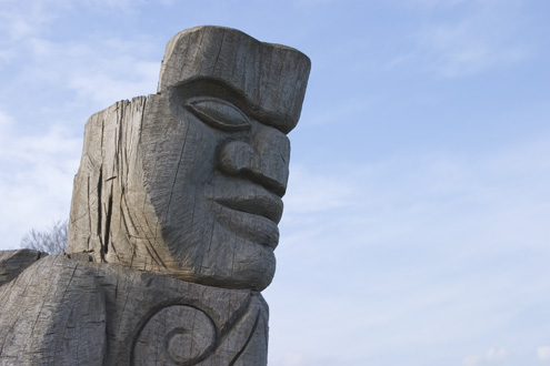
This weeks photo is taken at a earlier occasion which actually has driven two other photos namely number 12 and 13. It was obviously a good photography day because there are a number of other photos which are worth publishing. Above you can see a head carved in wood which scouts out over Øresund at Strandmøllen (Denmark). The picture may give some associations to the famous stone statues at Easter Island.
Weekly Photo #19
May 7, 2004 | 0 Comments
Ahh, how lovely. What can two sweet tulips be a symbol of? How about royal love? I think it fits perfect to the moment, so therefore they are this weeks photo. The picture is taken on a longer walk which among others places lead me through Ordrupgaard and the museum which is now undergoing construction for extension.

Advances for photo presentation techniques?
May 2, 2004 | 0 Comments
As some of you may have already seen I've updated my photo gallery article with a list of features that a great photo presentation should include plus a list of a few software tools that I've found during my research. My research is not yet finished and I'm still looking into available tools, technologies and what ever that can be useful for presenting photos in an exciting way.
One of the more advanced features that I request for photo presentations are zooming and panning - also known as Ken Burns effects. Ken Burns is a filmmaker that was famed for the his use of moving still images in a 1990 documentary about the US civil war.
One technology which looks promising and already have some support in browsers etc. are SMIL defined by W3C. SMIL is an acronym for Synchronized Multimedia Integration Language - a kind of HTML with support for timing - a way of specifying how and when elements should be presented.
I've managed to build a couple of test photo presentations using Microsoft's Internet Explorer support for SMIL also known as HTML+TIME. They work in IE6:
For those of you interested you should look into the source code (aka. view source via your browser). I'm beginning to feel that combining these techniques really can make a stunning presentation.
Thanks to Cybarber for inspiration.
Weekly Photo #18
May 2, 2004 | 0 Comments
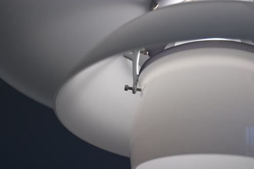
I've been playing with custom white balance (WB) for examining whether there is any benefits with it. Let me just conclude that there are, as this weeks photo has been taken with custom WB and really shows the potential.
Remember you can get a black background easily get by choosing my CSS1 layout style. Select CSS2 to go back to the original style.
Weekly Photo #17
April 25, 2004 | 0 Comments
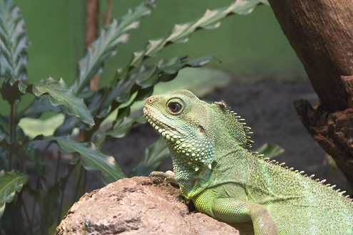
It has been a good photo week. I've finally started one of my photo projects, which hopefully should end up in a series of photos next year. I have a little photo book with that I write all my ideas into. Among other things I have several other photo projects on my wish list. Also I of course have my weekly photo as my only current public photo project. Mostly however it is for my own sake - and is mostly a training project for learning the camera and to improve my digital darkroom skills. This weeks photo is from yet another trip to the Zoo where I - this time - was a bit more prepared for taking photographs inside the humid air of the tropical vivarium.
Weekly Photo #16
April 18, 2004 | 0 Comments
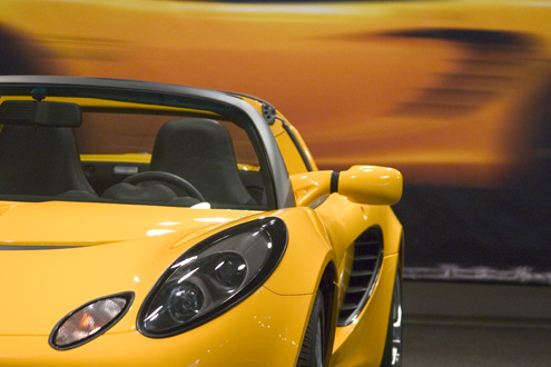
Not much to say if you have read the previous post... This is of course a shot from the Copenhagen Motor Show 2004.
Mega Photography Day
April 17, 2004 | 0 Comments
It was photography maniac day yesterday for me. I've went to Copenhagen for a 8 hour photography tour to two opening events - the Copenhagen Motor Show 2004 and Tivoli - the amusement park in central Copenhagen. I took about 183 photos from the Motor Show and about 97 photos from Tivoli. Nice going, right? Not exactly - my feet are aching.
All the photos are taken in RAW+JPEG (Small) format using about 1.7GB of memory. With that rate I pretty soon need a new hard disk. I'm considering buying a 250 GB - which will be able to handle about 160 similar mega photo days. I can see where this leads me... However I think that I should change the setting to RAW+JPEG (High) and use an approach like described in Rob Galbraith's excellent article about the photo workflow process used at Sports Illustrated magazine. I highly recommend the article which gives an excellent insight in the world of professional digital image workflow.
Well, at the moment I've spending some time for selecting and editing the images for my archive - something which is not always as fun as taking the photos. I've also noticed that I am becoming more and more demanding in my selection of which photos that I like and particular which ones that I like to present to the public. I hope that you agree that my photography skills are increasing, slowly but surely. But, but - I have a lot to learn.
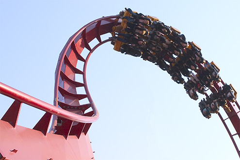
Weekly Photo #15
April 10, 2004 | 0 Comments
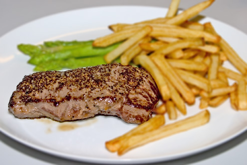
Once and a while you pull yourself together and make a decent meal for yourself. If you combine the cooking with your photography you may exercise both skills. None of them may be easy to perfect but it may be fun exercise. If you want to photograph the moment where the meal presents itself from the best side you must be quick and have some flair for presentation. The above photo is taken of a moment where the meal - Beef and french fries garnished with green asparagus - itself is somewhat easy to prepare. The picture is treated in Photoshop to make it extra presentable - among other things I've used the lens blur filter to blur the area around the beef. Take a bite...
Ansel Adams Documentary
April 6, 2004 | 0 Comments
 When I was in USA I bought the PBS
DVD documentary Ansel Adams
a film directed by Ric Burns. I bought the DVD because I'm interested in photography and thought that the documentary would
inspire me.
I would say that the documentary is quite good if you would like to know about the life of Ansel Adams from when he was born and to his dead. You'll see a lot of great black/white/quicksilver photographs, of course, and many dynamic shots of his beloved Yosemite Valley.
“photograph eight hours a day and use the light”
However I would say that you do not particular learn anything about his techniques other that you should go out and photograph 8 hours a day and take photos when the light is "good". Well, this is indeed something that you already should know if you want to become a photographer. It is briefly mentioned that he spend a lot of time in the darkroom to perfect the photos. This was quite interesting information for me at least.
Some of the photos in the documentary are inspiring, particularly I remember one taken - if I'm not mistaken - in Arizona. However I suspect that a book with Ansel Adams photos would have done the same for me.
I think the best of the film was that you get an understanding of the particular time in the beginning of the last century and the difficulties that photographers were facing at that time - and particularly Ansel Adams difficulties.
Conclusion: It is not a photography technique documentary but a history of Ansel Adams life and as such it works perfect. Enjoy.
Physically Spammed?
April 3, 2004 | 0 Comments
From the previous entry you may have noticed that I've been away on business for about a week. When I arrived back home and tried to open my apartment door I nearly couldn't get it open due to all the stuff the postman has been bringing out while I has been away. You see here in Denmark the postman brings all post directly through the letter slit of the apartment door, well at least some places.
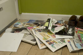
As you can see on the photo this is what I get within a weeks time. Mostly it is commercials from the local supermarkets, a few local (free) newspapers - again filled with a lot of commercials and a few crap stories to let it look like a newspaper. I consider it as being spammed in the physical world! I cannot simply delete it. I have to go down to the local paper recycle station or the garbage can with all that stuff. Annoying.
Of course I also receives important letters to handle - such as paying a bill or other matters. The heap luckily also contained a few magazines that I read, such as Canon EOS Magazine and Adventure World (Danish). And that was the best stuff within all that crap.
Weekly Photo #14
April 3, 2004 | 0 Comments
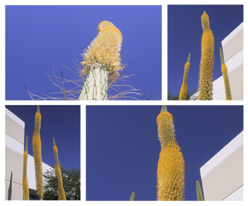
Once again I've been in Phoenix, Arizona, USA on business and had the opportunity to take some photos of some very beautiful blooming succulents, which I think must be of the species Agave Vilmoriniana. I've arranged the photos in a postcard format.
Weekly Photo #13
March 21, 2004 | 0 Comments
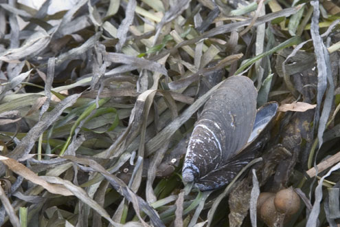
This is one of those pictures that happens to look the best when the background is dark. You can easily get that by choosing my CSS1 layout style. Select CSS2 to go back to the original style.
I've been sitting the whole Sunday (neglecting all the stuff that I've should had done, damn!) and extended by XML based slide show photo gallery software as described in my article from 2001.
You can see the result of my little experiment here: Scandinavian Light (works only in IE). I find the result rather satisfying.
Weekly Photo #12
March 14, 2004 | 1 Comment
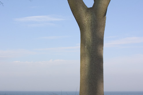
I've been out and testing my new 4GB Microdrive on a bike cycle photo tour in Dyrehaven and at the Øresund. I've taken about 240 photos and there are still lots of space left on the card. Super cool. Of course there are some nice pictures among the photos, however at first I have to choose one for my weekly photo. The above is a crop of picture of a lonely tree with a nice sea view towards Sweden.
Comments
2004-03-16 Joris van den Worm, Amsterdam
Incredible beautiful picture! Denmark's light 'in a nutshell'! Compliments from a Denmark freak.
Write your comment - via e-mail.
Weekly Photo #11
March 7, 2004 | 0 Comments
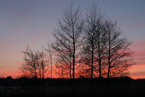
This weeks photo is from a walk along Lyngby and Bagsværd Lakes around sunset. I've create a photo gallery with additional photos from the walk.
Weekly Photo #10
February 28, 2004 | 0 Comments
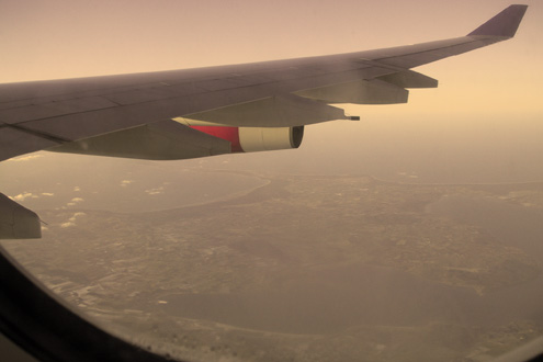
Yet again, I've been away for business in Arizona, sigh. This time I'd brought my little Canon PowerShort S20 camera with me - and with its limited battery lifetime and too much work, only a very few pictures has been taken this week.
On my latest travels there have actually been some opportunities to take some potential good photos from the airplane window - especially during landing at nighttime near an American city skyline, like Phoenix. It hasn't really succeeded. Partly because I often has reserved a aisle seat and partly because the photos become somewhat "thin" in the colors. Nighttime photos are also not easy when the airplane are moving.
The above photo is taken out of the airplane window towards Hornsherred (Sjælland, Denmark) right after takeoff with SAS to Chicago. The resulting photo was boring with its color so I have applied a sepia filter on it to give another feature. I think it has become more exotic - may be even a kind of expedition-like.
Another idea, which I haven't used on this weeks photo is to apply a Lomo Effect on it. While this is quite neat it doesn't really fit into the "style" of my weekly photos.
Weekly Photo #9
February 22, 2004 | 0 Comments
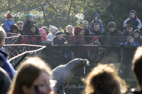
The Zoo is a fantastic good place to test your photographical skills. There are plenty of subjects, whether that being the animals themselves or the people around them. Since it was some years ago I went to Zoo the last time, I was somewhat surprised by the number of photographers present. But that only testifies the qualities of the location. On the contrary I was not surprised that so many families was present and that the children are especially happy about it. It pays to offer the 300 Danish kroner (approx. €40 Euro or $50 US Dollar) for a all year entry pass (normal price is 100 Danish kroner), so that you not only can take several photo trips but also invite your family. This weeks photo is from the sea lions lesson (feeding time). Expect more photos from the Zoo...
Weekly Photo #8
February 15, 2004 | 0 Comments
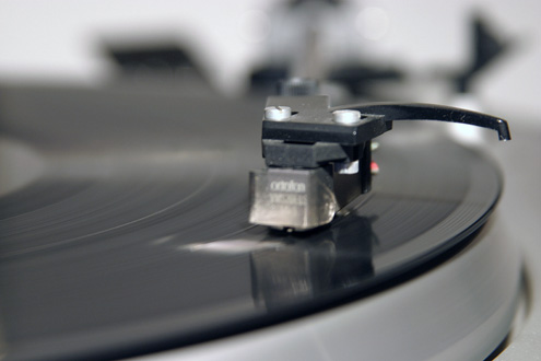
Not much to say. This weeks photo is an attempt of macro photography, even though I don't own a dedicated macro lens. The picture is if anything antiquated because not many homes have a old-fashioned record player anymore. But I have; and you may wonder what that makes me. While I took the photos I listened to an old record by Rick Astley. That old 80'ties boy! Again you can wonder what that makes me. I don't think we should go further into that here.
Photography in Denmark
February 14, 2004 | 0 Comments
Photography is in in Denmark. The appearance of the digital camera has started a renaissance in photography which is unparalleled. Persons which in the 70'ties fooled around with the camera and hided in the old-fashion darkroom, have been given new blood and the desire for taking photographs has again increased. Daily you receive questions about which digital camera to buy; I use to refer to my page with considerations (only in Danish, sorry) and the best camera site on earth www.dpreview.com.
Also the Danish newspapers have seen the light and they publish endless appraises of Danish photographers which again and again have won international competitions in photography and they write about - what seems to be monthly - photography exhibitions. One can wonder why some of of the Danish photographers, like Jakob Holdt, Krass Clement and Erik Refner seems to preferring to take their photos outside Denmark. Maybe they find the subjects more exotic? Surely the histories behind the photos are different. War, unjust and poverty is - luckily - rarely seen in Denmark. For all us amateurs the subjects must be found in the local arena and that must be our challenge. To find subjects, angles and present the histories in different and new ways must be the way ahead. A project that shows the way is Tao Lytzen's IDdK showing off 365 photos from all around Denmark - one for each day in the year. All the photos are actually now presented in an exhibition in Øksnehallen (Copenhagen)
For most people the digital camera is just about taking photos for the family album, but I wouldn't be surprised if we find that some will take it further and present us with wonderful pictures affecting all of our lives.
Yes, photography is in in Denmark.
Some fun with CSS
February 12, 2004 | 0 Comments
I've played a bit with CSS and especially regarding fixed background, may be somewhat inspired by Eric Meyer's complexspiral demo. The result can be chosen by activating style sheet CSS4 on this front page. It's pretty cool that you can do such things. To go back to the original layout you may choose CSS2.
Weekly Photo #7
February 8, 2004 | 0 Comments
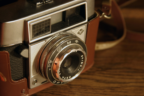
When I take photographs I'm inspired by many things. This weeks photo for example is inspired by an article in the magazine Practical Photography about still life photos. One of their pictures showed an old camera and I thought it could by funny to do something similar. I wouldn't say that I'm satisfied with the result, which can be seen below, because I didn't have enough time and the light was also rather poor. However it was good practice...
Weekly Photo #6
February 8, 2004 | 0 Comments
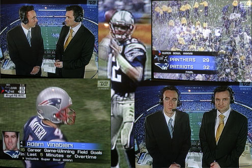
For about a week ago the Superbowl XXXVIII was played in Houston, Texas, USA. Here in Denmark the local TV-station TV2 transmitted the game live at local time 12.25 AM to 4.30 AM with two presenters at the Reliant stadium. I've followed the NFL for most of the season and find the game rather interesting. There's a lot of strategy involved in the game even though the brute-force method plays a central role. The Superbowl game was excellent with a close finish in favor of New England Patriots. During the game I experimented with taking some photographs of my TV and I've created this weeks photo based on these photos.
Weekly Photo #5
January 31, 2004 | 0 Comments
I can assert that it is difficult for me to get the time I need for taking photographs. There is only one way to take good photographs and that is to take as many as possible. To take many photographs I need time. Time which must be prioritized among all the others things that I must do during the busy week. With a nine to five full time job (which is not about photography) I'm pretty tired after work on a ordinary weekday. Left is only the weekend which always is busy because you must do a lot of maintenance, whether that being filling up the refrigerator, cleaning or whatever. Hardly I cannot permit myself to complain. I'm single, lives alone a have no children so time should be available. It must be. There is only one way - just do it.
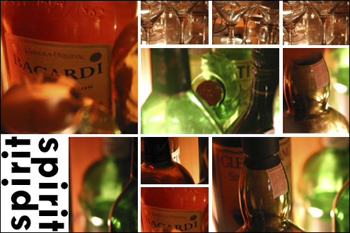
The photograph - or actually the photographs - for this weeks photo is taken at home in my apartment. Very convenient and almost too easy. I'd set the camera to ISO 1600 and photographed into my bar shelve. The different photos are - inspired by www.wdphotos.com - cropped and put together into a postcard in Photoshop.
Crashing IE6
January 27, 2004 | 1 Comment
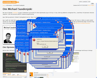
I've lately discovered that sometimes I've been able to crash Internet Explorer 6. I expect that some of my latest experiments with adding automatic image caption using JavaScript may have something to do about it. At least I has received a very funny Visual C++ Runtime Library error when I enter my Danish about page (beware you may crash your current IE session!). See screenshot below. Anybody having any clues?
Comments
2004.01.28 - Michael
After having spent a couple of hours on the problem it seems that IE sometimes have problems with JavaScript such as:
var oOldElem = oElem.parentNode.replaceChild(oNewElem,oElem);
// This line sometimes crash in IE with error R6025!
Precisely why is not clear for me. I indeed use this type of code in my addCaption JavaScript function. Maybe it have something to do with the rendering mechanism. I don't know. Essentially my HTML code look like this
<div>
  <a><img/></a>
  <a><img/></a>
  <a><img/></a>
  <a><img/></a>
  <a><img/></a>
</div>
After my addCaption JavaScript code has run the code should (will) look like:
<div>
  <div><a><img/></a></div>
  <div><a><img/></a></div>
  <div><a><img/></a></div>
  <div><a><img/></a></div>
  <div><a><img/></a></div>
</div>
It seems that the fifth <a><img></a> sections fails in the replaceChild function, as mentioned above. Why? If I change my HTML source code to the following (or remove the fifth section), everything works just fine:
<div>
  <a><img/></a>
  <a><img/></a>
  <a><img/></a>
  <a><img/></a>
</div>
<div>
  <a><img/></a>
</div>
I'm extremely mystified....
Write your comment - by using email.
Blogging with FrontPage
January 25, 2004 | 0 Comments
My site is currently not running as a true web log (blog). It does not have a RSS feed nor does it have its contents stored in a XML file or in a database. However I would like that my content (data) was stored in XML file and was syndicated in RSS. However as long as I'm using MS FrontPage as my editing tool it seems that this is not possible.
“I hate server software”
That is, until I saw John Walkenbach's blog entry Blogging with FrontPage. I find this very interesting and would like to start my own VBA coding project for this. But as usually it is always good practice to examine whether something already exist - why do something when others already have done it (I know there are exceptions to that rule ;-). FrontPage 2003 do seem to have capabilities in the desired direction but the built-in XML/XSL support requires Microsoft's SharePoint Server. Why is it that some server software always is necessary? I hate server software - especially server software that I do not control.
As I'm writing this late Sunday evening I do not have time to throw myself into the VBA coding - even though I'm inspired to do so. I do have a job that I like and must wake up rested for tomorrow. So good night - and if any of you out there have any idea about utilizing FrontPage for blogging (without server software) then let me know...
Weekly Photo #4
January 25, 2004 | 0 Comments
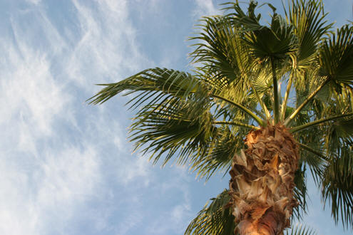
Now, I haven't said anything about any rules for my current "weekly photo" project, so the photo doesn't necessarily have been taken in the past week, even though I would like it that way. I've been away on business for the entire past week. Actually I've again been visiting Phoenix, Arizona and I haven't had the time to take any photos. I'm sorry about that - double sorry when I know that Arizona offers so many wonderful places - and a lot of photo opportunities. The photo below is therefore taken at one of my earlier visits to Phoenix. At this winterly time in Denmark such a warm picture is .... well, warm.
Weekly Photo #3
January 17, 2004 | 0 Comments
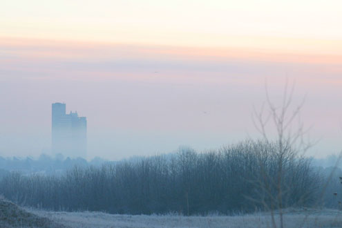
In the past week the whether here in Denmark changed from rain, snow, thaw, frost, clouded, clear whether and what ever. For some time I've waited for high pressure whether preferably after a period of snowing. High pressure whether at this time of the year (winter) will often indicate clear cold whether - and therefore excellent for photo opportunities, especially during the morning, where the sun can light the sky in cool colors. Last Thursday I saw the opportunity for cold clear whether - even though it was not exactly with high pressure and white snow. However I decided to leave my apartment a little earlier than usually so I could spend some quality photographing. The idea was to capture a glass-building in the dark, however my timing was a little late for that, so instead I took the photo below, which is this weeks photo.
Auto caption on photos
January 11, 2004 | 0 Comments
I hate typing the same text twice - I guess that you do too. When you include an image or photo into your HTML page you typically want to write a caption to the photo. At the same time the Web Accessibility Content Guidelines tells you that must provide a description in the alt attribute of the HTML img element (see guideline 1, checkpoint 1.1 in the WCAG 1.0). The alt attribute should contain alternate text for browsers not displaying the image. However typically it is used as caption text for the image.
“I want to type the caption only once”
Since I often write the same image caption text - as I wrote in the alt attribute - in an following paragraph I often find that when the caption text changes I do forget to update the alt attribute text - or vice versa. I therefore wanted to write the text only once - namely in the alt attribute and then utilize JavaScript to append the image caption text automatically. So I have e.g. the following img element:
<img class="photo"
     onload="javascript:addCaption(this,true)"
     src="myphoto.jpg"
     alt="The photo show me in the hands of a beautiful woman."
     copyright="Photo | Michael Suodenjoki"/>
Read the Full article »
Weekly Photo #2
January 5, 2004 | 0 Comments
The busy everyday have uncomfortably started again. This shouldn't prevent you from using your digital camera. As have been exemplified by a Danish photographer it is possible to publish a photo everyday for a whole year. It is not exactly my style but the project IdDK has produced many excellent photos. There is nothing better to increase your photography skills than using your camera everyday. I will occasionally here on my site publish one of my photos, which I ambitiously can call the weekly photo... well we will see how far it goes.

Favorite Websites
January 5, 2004 | 0 Comments
In the past year I've read a number of cool websites - and which, I therefore would like to pass on. Of course there are many other great websites on the Internet, however the list below are the ones that I like:
- Mezzoblue, by the author behind CSS Zen Garden. Lots of cools CSS tips and tricks.
- fotokritid.dk - Danish page with critics on photographs.
- A List APart - cool CSS tips.
- Photoblogs.org - blogs with lots of cool photos. There are many creative designs to be visited.
- Asterisk* - cool music and blogsite in a creative design.

